
Rapunzel

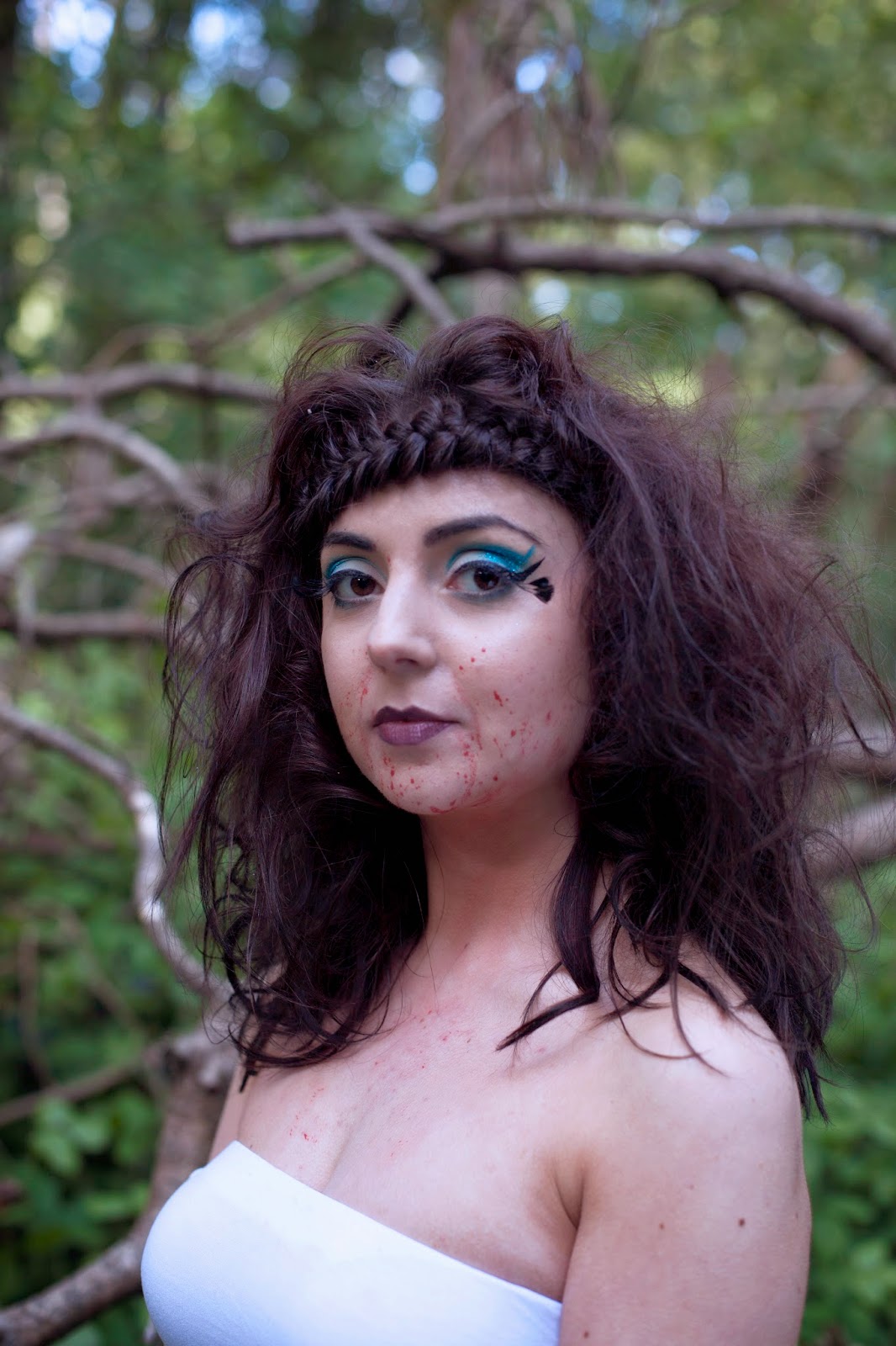
This is the raw image of my Rapunzel makeup. I chose this head shot because I liked it having all the hair in and it had a good amount of light from the location lighting and shading to make the image look powerful and three dimensional.


After I had finished this I decided to do a bigger edit and add in a fullness of hair on the right side of the head. I wasn't happy with how the angle made the volume at the back look like it was just in the middle and feel I should have added more backcombing there. Therefore I used the clone tool and added the fullnes there to even out the look.

This is the raw image of the far look for Rapunzel makeup. I chose this image because I liked the positioning of the camera in relation to the models body. I think it shows the skirt very well as well as having a good amount of background around the fallen tree. I also liked the model looking past the camera off to the side.

This is the first edits of the look doing the touch ups to the hair and makeup. One of the main edits I did was taking out a branch that went over the models clothes and arm. I found this distracting to the look but I wanted the set up of this photo so I edited it out using the clone tool. The other edits were again simple like the previous rapunzel makeup such as a few stray hairs that went over the face.

I then added the same cooling filter (LBB) which added a much darker feel to the photo and kept to the theme of Grimm fairy tales.

This was the finished result of the editing to the photo. Again I made the change to add fullness to the hair on the right side and I feel this makes a big difference to the overall look of the piece. I then added a text box on the left side of the page, mirroring what is done in all fashion magazines. It a box that was the name of the character at the top (in capitols) then has the clothing and jewlerry information for both pages in (made up for the purposes of the context) for the formatting of it I used three different fashion magazines to see the common themes across all three and mirrored this. I feel this adds a lot to the photo and immediately makes it look in the context of a magazine.
Cinderella


This is the first stage of editing for the look with the hair and makeup touch ups done. The main change I made was smoothing out the edges of the prosthetic I applied, including the big wrinkles at the left side and bottom. This would have been done if it were for a real fashion magazine so I thought it was important to do it here. One of the other changes I made was adding a diamante at the top row on the right hand side were one had fallen off on location. As I had in the rapunzel makeup I also dulled some of the glitter that had caught the flash light.

I then added the same cooling filter (LBB) as well as altering the brightness and contrast slightly.

This is the original image for the far shot for Cinderella. I chose this one as I think it has a lot of character with the model turned slightly to the side but looking straight into the camera. It's also very well lit.

This is after the first edits. Again I smoothed the edges of the prosthetic piece where there were big wrinkles were and this is improved the overall look a lot. There were very few other changes I made to this look as I was happy with everything else.


And this is after adding the textbox that is featured on all the far shots of the models, I added it on the opposite side of he page because these pages will be the other way round to the other two to make every page layed out slightly differently. Again I feel it added a lot to the look and made it look much more in context.
Beauty

This is the raw unedited image of the head-shot I chose for beauty. I had trouble choosing this one as I wasn't as happy with the headshots for this model - I feel they weren't as in-keeping with the theme of being eerie and slightly creepie. This one is quite plain but shows the hair and makeup nicely and isn't completely straight on making it look more interesting.

This is with the first layer of retouches on. For this look there were only a few changes I made - I brought the hairline slightly lower down so there wasn't skin showing between the marteax and hair line, I added a little more blood under the chin where over the time to location it had rubbed off and I smoothed out a few spots and lumps on the models skin that could be seen because of the quality of the photo. I also defined the bottom lip liner ever so slightly so it could be seen more clearly.
I then added the same cooling filter (LBB) and a little brightness and contrast adjustment.

This is the original far away image for the beauty shot. This is one of my favourite images and we got the model to this position as it's as if she's looking for a following the dove from the original story. I chose this image as the arms are close to side making it look more eerie and it also doesn't have the models shoe in like some of the others do.

This is the shot after the first retouches. The main changes I made was editing out the obvious bra line that was showing through on my models top. I found this was distracting from the look of the piece so changed it too look smoother. I made very few other changes.

This was after the cooling (LBB) filter was applied.

This was after adding the same text box to the image. I really liked the positioning of the box in this photo and think it makes it look very professional and in-keeping with the context.
Cover

This is the image I chose for the group shot. The other set was too dark and this set up worked a lot better. I chose this image as the sun had just come through the clouds when this was taken so there's natural light coming through the background, adding a lot of depth.

This was after doing a few touch ups to each model such as moving beauty's hair line down slightly. I then added the cooling filter (LBB) as well as changed the shadow tone colour to include for cyan.

I then added the title I had chosen for the collection - 'and of she went...' is a line from The Singing Spring Lark and I think it explains the collection well. The three Princesses are all meant to have been wondering round the forest for years so are an alternative to the classic princesses. I think this line is simple and effective for explaining this and comes from the original story I have been working off for this collection. The font and lay out of the text mirrors fashion magazines I was looking at to inspire this.

All the fashion magazines then also had a small paragraph on the title page that explains the collection and gives us the name of the stylist and photographer. I mirrored the format of this and wrote my own paragraph. I feel this really puts the photo in the context I was aiming for and makes it look like the title page for a fashion magazine collection.

I then decided the image was too dark to the point where it was difficult to see the hair and makeups so I added some brightness to the photo.